Develop an Analysis
This brief tutorial takes you through the basics of a “real world” analytic workflow. In this case, the workflow is built around conducting an independent analysis of the Protect Chicago Plus program that enhances SARS-CoV-19 Vaccination availability and outreach in communities in which uptake is low and infections and deaths are high.
We’ve examined maps that help to visualize the disparities in where COVID cases are and where vaccinations are more prevalent:
As of February 17, 2021, Chicago is reporting 95,321 people fully vaccinated: 3.4% of the population.
— ChiVaxBot (@ChiVaxBot) February 18, 2021
Who is dying: Who is vaccinated: pic.twitter.com/LZt6OPYgiN
The initial goal of our analysis will be to verify that the City has designated those community areas for Protect Chicago Plus with high levels of need. From there, we will also explore some of the demographic correlates associated with these neighborhoods to think about further questions that may emerge.
What we’re doing here is loosely a validation of existing policy targeting. From there we can think about how we might use questions that emerge from our validation for further exploration and explanation.
Getting Set Up
As usual, we’ll start by loading some packages.
library(ggplot2)
library(tidyverse)
## ── Attaching packages ─────────────────────────────────────── tidyverse 1.3.0 ──## ✓ tibble 3.0.4 ✓ dplyr 1.0.2
## ✓ tidyr 1.1.2 ✓ stringr 1.4.0
## ✓ readr 1.4.0 ✓ forcats 0.5.0
## ✓ purrr 0.3.4## ── Conflicts ────────────────────────────────────────── tidyverse_conflicts() ──
## x dplyr::filter() masks stats::filter()
## x dplyr::lag() masks stats::lag()library(RSocrata)We’ve spent time with ggplot2 and tidyverse prior but not RSocrata. RSocrata is an R interface for Socrata, which is a data platform designed to host public-facing open data (and which is used by many local governments).
In this case, we’ll use RSocrata to load data for City of Chicago’s datasets on COVID Cases and Deaths
cdph<-RSocrata::read.socrata("https://data.cityofchicago.org/resource/yhhz-zm2v.json")Exploratory Plotting
The data on COVID case positivity contain multiple observations for each ZIP code (one per week). We can use geom_path() to create line charts that chart the positivity rate over time:
cdph %>%
  ggplot(aes(x=week_end, y=as.numeric(case_rate_weekly), group = zip_code))+geom_path()
## Warning: Removed 187 row(s) containing missing values (geom_path).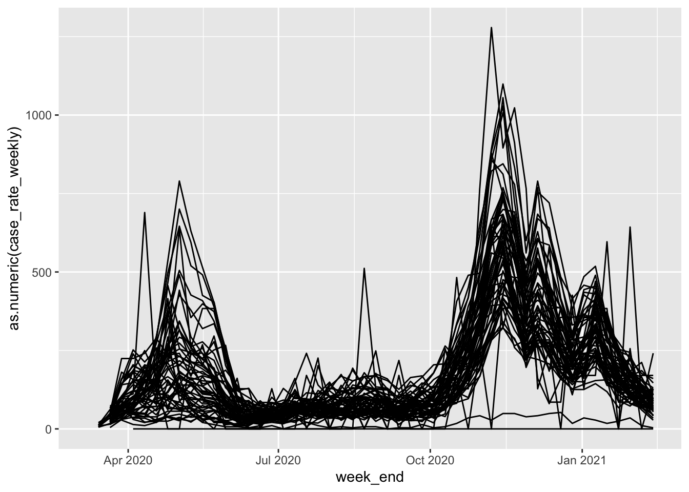
Who - a little messy, but we can already see some general trends regarding case positivity. THere are two main “humps” where overall case rates go up, one in summer, and one in fall. At the same time, we can see that there’s some spread - some ZIP codes have much higher peaks and do not see rates return as low as others.
The primary question at this point is, do those ZIP codes with higher peaks and continued elevated rates correspond with the Protect Chicago Plus designation?
Identify Protect Chicago Plus ZIP Codes
Documentation from Protect Chicago Plus lists the specific Chicago community areas where enhanced outreach and vaccinations will take place. Here’s a Community Area map for reference with Protect Chicago Plus areas highlighted in blue:
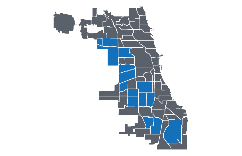 Community Areas are a Chicago-specific geography. The data we downloaded on case positivity is at the ZIP code level. How do we reconcile these two things? We could be fancy and use some spatial methods to find the overlap between the selcted community areas and zip codes, but let’s do this manually for now using visual inspection.
Here’s a map from City of Chicago that overlays Community Areas and ZIP Codes.
We can start eyeballing which ZIP codes overlap which Community Areas. Here’s a rough list of the overlap:
- Austin - 60707, 60639, 60644, 60651
- Archer Heights - 60632
- Back of the Yards (New City) - 60609
- Belmont Cragin - 60634, 60639, 60641
- Chicago Lawn - 60629
- Englewood - 60621
- Gage Park - 60629, 60632
- Humboldt Park - 60612, 60624, 60651
- Little Village - 60608
- North Lawndale - 60623
- Montclare - 60707, 60634
- Roseland - 60628
- South Deering - 60617
- Washington Heights - 60620, 60643
- West Englewood - 60636
Our visual inspection leaves us with a list of the ZIP codes which are (roughly) targeted for Protect Chicago. There is not perfect correspondence, and some of the residents of the ZIP codes will not be targeted. However, the rough correspondence should help us understand some general patterns that allow us to compare case positivity between designated and undesignated ZIP codes.
Let’s create a new categorical variable in our CDPH data called Targeted, and label those ZIP codes that are part of our list “Protect Chicago” and all other ZIP codes “Other ZIP Code”:
cdph<-cdph %>% mutate(Targeted = case_when(zip_code %in% c(
  "60608",
  "60609",
  "60612",
  "60617",
  "60620",
  "60621",
  "60623",
  "60624",
  "60628",
  "60629",
  "60632",
  "60634",
  "60636",
  "60639",
  "60641",
  "60643",
  "60644",
  "60651",
  "60707") ~ "Protect Chicago",
  TRUE ~ "Other ZIP Code"))
case_when() is a useful tool for conditionally recoding values. Here we are telling it when a value in the zip_code column corresponds to the list of ZIP codes given, we’ll label those rows “Protect Chicago”. All other rows will be labelled “Other ZIP Code”. As a reminder, we use a mutate() statement to create a new variable.
Now we can re-visit the previous plot, but this time, let’s color each of the zip codes by whether they are targeted under Protect Chicago or not:
cdph %>%
  filter(population > 0) %>%
  ggplot(aes(x=week_end, y=as.numeric(case_rate_weekly), colour = Targeted))+geom_path()
## Warning: Removed 4 row(s) containing missing values (geom_path).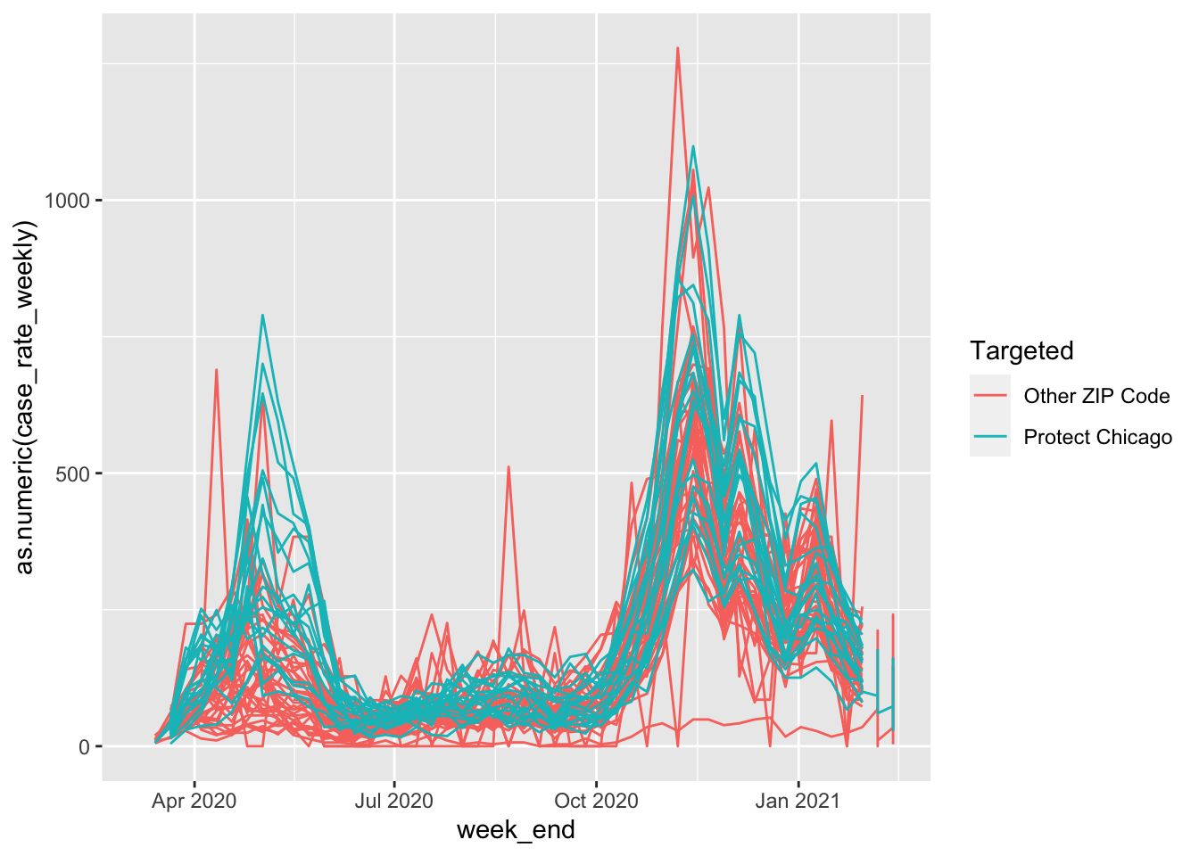
It looks like there may be a pattern, but it can be a bit hard to see due to overplotting. Let’s change the alpha (transparency) on our plot geometry to see what’s going on under all those lines:
cdph %>%
  filter(population > 0) %>%
  ggplot(aes(x=week_end, y=as.numeric(case_rate_weekly), colour = Targeted))+geom_path(alpha=.2)
## Warning: Removed 4 row(s) containing missing values (geom_path).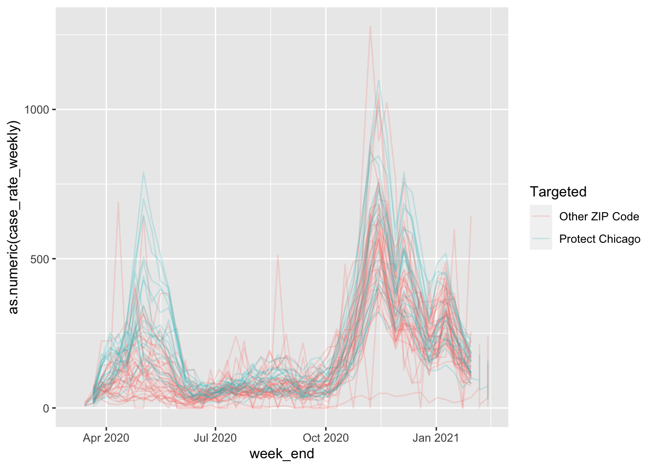
And let’s also add a statistical summary line for each series. By default GGPlot uses a loess smoothed line:
cdph %>%
  filter(population > 0) %>%
  ggplot(aes(x=week_end, y=as.numeric(case_rate_weekly), colour = Targeted))+
  geom_path(alpha=.2)+
  stat_smooth(se=FALSE)
## `geom_smooth()` using method = 'gam' and formula 'y ~ s(x, bs = "cs")'## Warning: Removed 133 rows containing non-finite values (stat_smooth).## Warning: Removed 4 row(s) containing missing values (geom_path).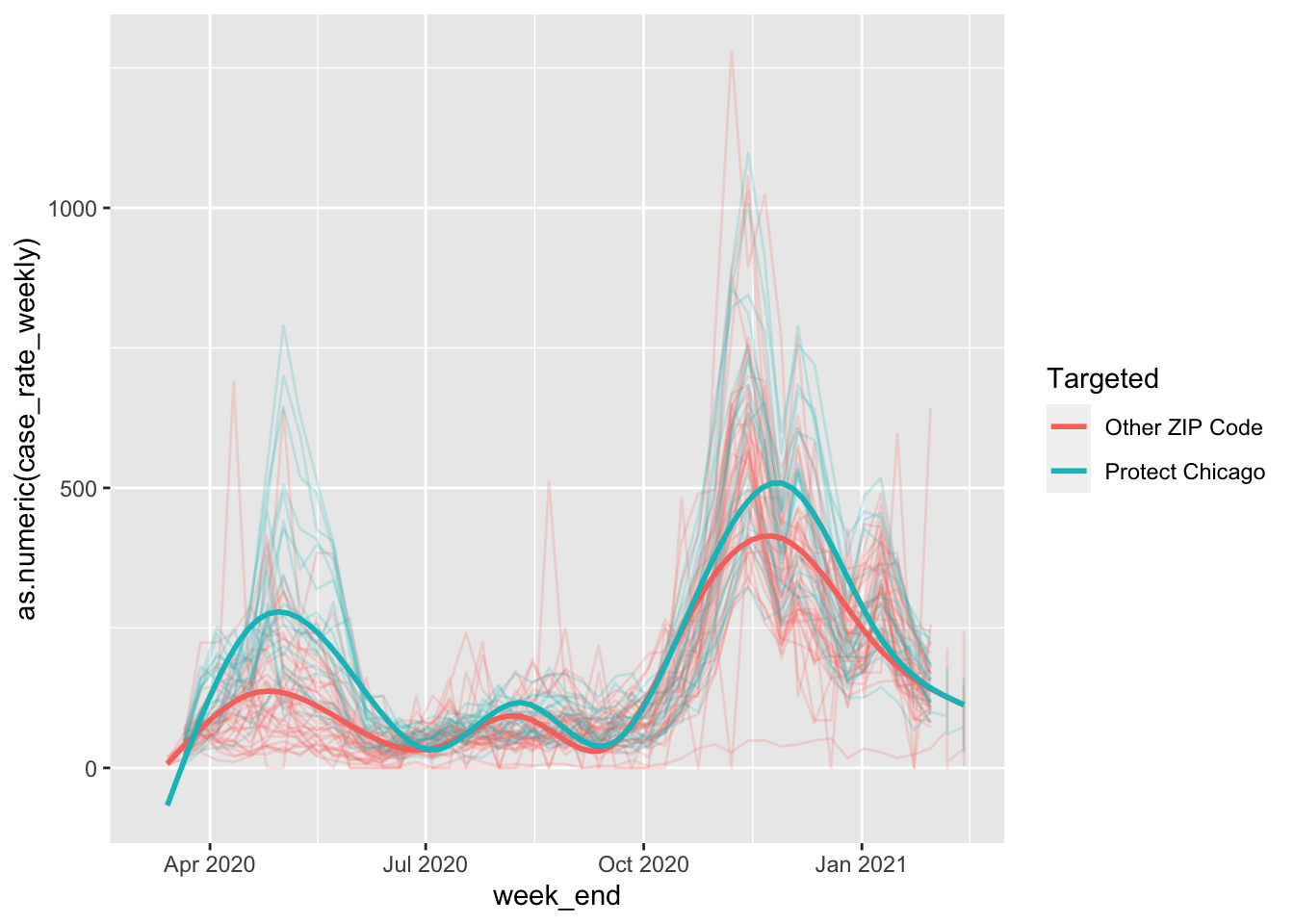
In the above code, I also removed the removed the error shading (se=FALSE) for visual simplicity.
This is looking pretty good - we can see some substantial differences in case positivity rates for Protect Chicago ZIP codes versus those that are not targeted. This gives us some confidence that the program’s targeting is appropriate.
We now have results that at face value make sense and help us to feel fairly confident that the program is targeting communities with the highest need. Given that, let’s invest in a clean up our plot by adding sensible labels and scale formats:
cdph %>%
  filter(population > 0) %>%
  ggplot(aes(x=week_end, y=as.numeric(case_rate_weekly), colour = Targeted))+
  geom_path(alpha=.2)+
  stat_smooth(se=FALSE)+
  labs(x="Date", y="COVID Case Rate (per 100,000)", colour = "Type")+
  scale_y_continuous(labels = scales::comma_format())+
  theme_classic()
## `geom_smooth()` using method = 'gam' and formula 'y ~ s(x, bs = "cs")'## Warning: Removed 133 rows containing non-finite values (stat_smooth).## Warning: Removed 4 row(s) containing missing values (geom_path).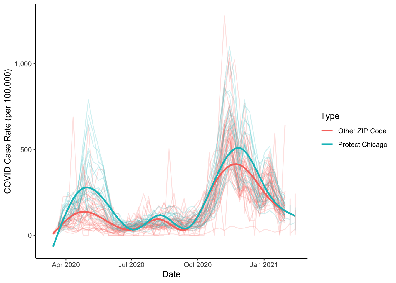
At this point, we might also consider a plot that does not include the data series but which just visualizes the statistical summaries of the data:
cdph %>%
  filter(population > 0) %>%
  ggplot(aes(x=week_end, y=as.numeric(case_rate_weekly), colour = Targeted))+
  stat_smooth(se=FALSE)+
  labs(x="Date", y="COVID Case Rate (per 100,000)", colour = "Type")+
  scale_y_continuous(labels = scales::comma_format())+
  theme_classic()
## `geom_smooth()` using method = 'gam' and formula 'y ~ s(x, bs = "cs")'## Warning: Removed 133 rows containing non-finite values (stat_smooth).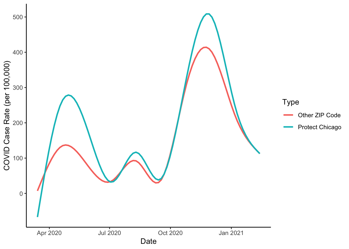
COVID Deaths
We have focused on plotting case positivity. In the past we’ve looked at COVID deaths as another important measure of need. Do the Protect Chicago Plus ZIP codes also have elevated rates of deaths per capita due to COVID? Let’s repeat the same plot for COVID deaths:
cdph %>%
  filter(population > 0) %>%
  ggplot(aes(x=week_end, y=as.numeric(death_rate_weekly), colour = Targeted))+
  geom_path(alpha=.2)+
  stat_smooth(se=FALSE)+
  labs(x="Date", y="COVID Death Rate (per 100,000)", colour = "Type")+
  scale_y_continuous(labels = scales::comma_format())+
  theme_classic()
## `geom_smooth()` using method = 'gam' and formula 'y ~ s(x, bs = "cs")'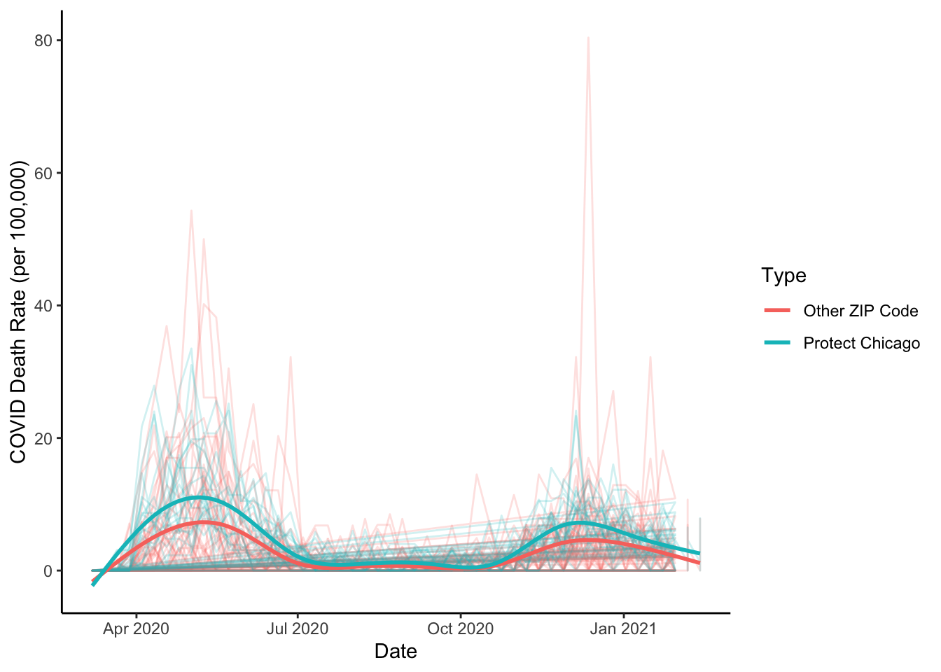
And the plot of the statistical summaries:
cdph %>%
  filter(population > 0) %>%
  ggplot(aes(x=week_end, y=as.numeric(death_rate_weekly), colour = Targeted))+
  stat_smooth(se=FALSE)+
  labs(x="Date", y="COVID Death Rate (per 100,000)", colour = "Type")+
  scale_y_continuous(labels = scales::comma_format())+
  theme_classic()
## `geom_smooth()` using method = 'gam' and formula 'y ~ s(x, bs = "cs")'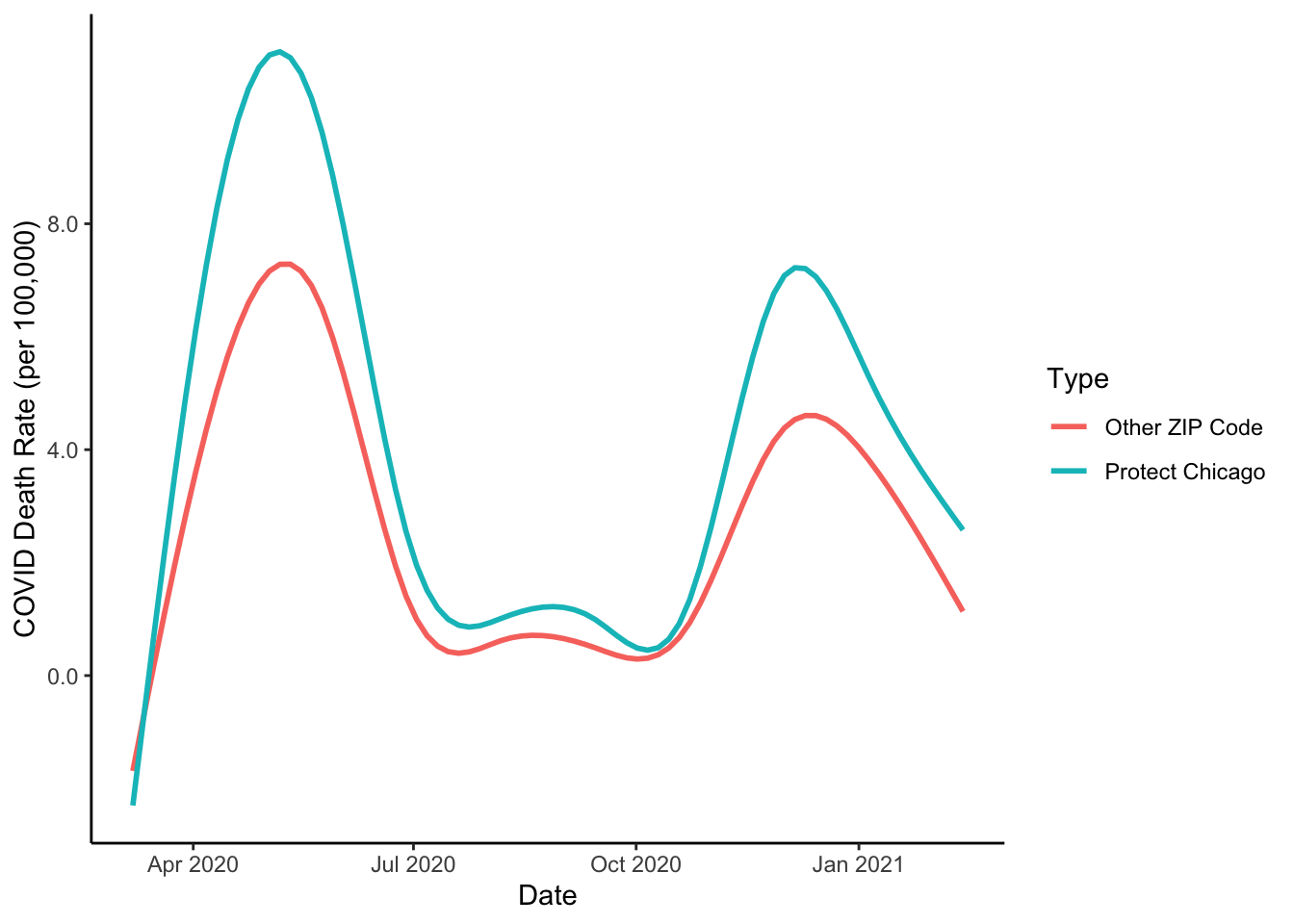
Much quicker now that we have a general plot format developed. We now have a good sense of one portion of the rationale for Protect Chicago Plus targeting - We know the program is targeting neighborhoods that tend to have elevated case positivity rates and death rates. But what about the vaccine situation in these same places?
COVID Vaccination Data
Let’s now load City of Chicago data on COVID Vaccination Rates
cdph_vacc<-RSocrata::read.socrata("https://data.cityofchicago.org/resource/553k-3xzc.json")Now that we’ve downloaded vaccination data, we can create the same Targeted variable in these data:
cdph_vacc<-cdph_vacc %>% mutate(Targeted = case_when(zip_code %in% c(
  "60608",
  "60609",
  "60612",
  "60617",
  "60620",
  "60621",
  "60623",
  "60624",
  "60628",
  "60629",
  "60632",
  "60634",
  "60636",
  "60639",
  "60641",
  "60643",
  "60644",
  "60651",
  "60707") ~ "Protect Chicago",
  TRUE ~ "Other ZIP Code"))
Now that we’ve added the Targeted variable, let’s make an initial plot similar to our final plots for COVID cases and deaths
cdph_vacc %>%
  filter(population > 0) %>%
  ggplot(aes(x=date, y=as.numeric(vaccine_series_completed_percent_population), colour = Targeted))+
  geom_path(alpha=.2)+
  stat_smooth(se=FALSE)+
  labs(x="Date", y="COVID Vaccination Rate", colour = "Type")+
  scale_y_continuous(labels = scales::percent_format())+
  theme_classic()
## `geom_smooth()` using method = 'gam' and formula 'y ~ s(x, bs = "cs")'
Ok, probably some clean up or noise in the data - it looks like we’re probably missing data for some zip codes (the straight lines). We could remove, but let’s proceed for now.
Let’s add a summary smoothed line as we’ve done before
cdph_vacc %>%
  filter(population > 0) %>%
  ggplot(aes(x=date, y=as.numeric(vaccine_series_completed_percent_population), colour = Targeted))+
  geom_path(alpha=.2)+
  stat_smooth(se=FALSE)+
  labs(x="Date", y="COVID Vaccination Rate", colour = "Type")+
  scale_y_continuous(labels = scales::percent_format())+
  theme_classic()
## `geom_smooth()` using method = 'gam' and formula 'y ~ s(x, bs = "cs")'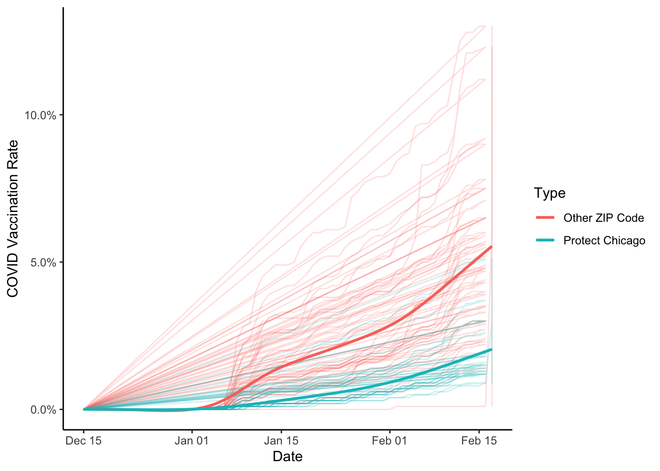
And let’s plot the summary without the data series:
cdph_vacc %>%
  filter(population > 0) %>%
  ggplot(aes(x=date, y=as.numeric(vaccine_series_completed_percent_population), colour = Targeted))+
  #geom_path(alpha=.2)+
  stat_smooth(se=FALSE)+
  labs(x="Date", y="COVID Vaccination Rate", colour = "Type")+
  scale_y_continuous(labels = scales::percent_format())+
  theme_classic()
## `geom_smooth()` using method = 'gam' and formula 'y ~ s(x, bs = "cs")'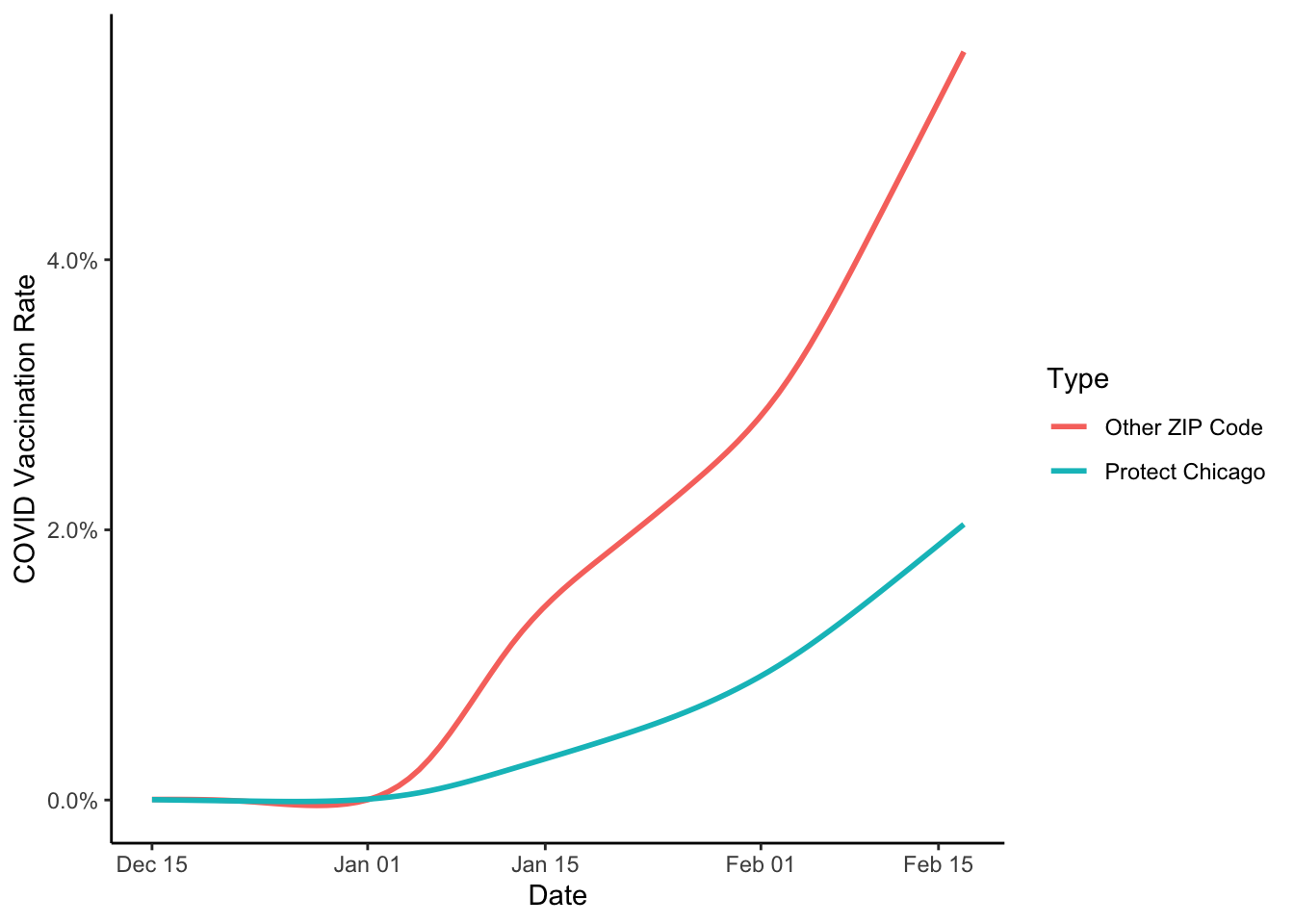
If we stop here, we could affirm that Protect Chicago seems to be targeting some of the most acutely impacted zip codes in the city, which is good, since that’s a major targeting principle of the policy!
Neighborhood Demographics
Let’s go a little further. Our list of targeted zip codes might lead us to be curious about the demographics of targeted and not targeted zip codes. I’ve downloaded some American Community Survey data which we can now load (downloading Census data is another tutorial):
chi_zcta<-read_rds("06_build_analysis/chi_zcta.rds")We’ve loaded data on ZIP Code Tabulation Areas (ZCTAs) which are the Census Bureau’s proxy for US Postal Service ZIP codes.
Let’s add a new column with our Targeted designations:
chi_zcta <-chi_zcta %>% mutate(Targeted = case_when(GEOID10 %in% c(
  "60608",
  "60609",
  "60612",
  "60617",
  "60620",
  "60621",
  "60623",
  "60624",
  "60628",
  "60629",
  "60632",
  "60634",
  "60636",
  "60639",
  "60641",
  "60643",
  "60644",
  "60651",
  "60707") ~ "Protect Chicago",
  TRUE ~ "Other ZIP Code"))
For these data, we could start by plotting, but in this case, let’s produce a summary table. We take the data, group it by whether a ZIP code was targeted or not, and then produce a summary table with the average values for ZIP codes (summarise_at allows you to select the specific variables you wish to summarize and then applies the same summary function to all of them).
Let’s start by summarizing a few race variables:
chi_zcta %>% group_by(Targeted) %>% summarise_at(vars(PWhite:PForeignborn), mean, na.rm=TRUE)## # A tibble: 2 x 8
## Targeted PWhite PBlack PAIAN PAsian PNonwhite PLatino PForeignborn
## <chr> <dbl> <dbl> <dbl> <dbl> <dbl> <dbl> <dbl>
## 1 Other ZIP Code 0.602 0.210 0.00346 0.114 0.398 0.150 0.200
## 2 Protect Chicago 0.321 0.484 0.00332 0.0250 0.679 0.346 0.177Next up, a few income variables:
chi_zcta %>% group_by(Targeted) %>% summarise_at(vars(Pov, PCI, MHHI, ServOccup, Commute), mean, na.rm=TRUE)## # A tibble: 2 x 6
## Targeted Pov PCI MHHI ServOccup Commute
## <chr> <dbl> <dbl> <dbl> <dbl> <dbl>
## 1 Other ZIP Code 0.157 55445. 78254. 0.153 0.144
## 2 Protect Chicago 0.253 20524. 41210. 0.262 0.206And finally, let’s summarize some housing characteristics:
chi_zcta %>% group_by(Targeted) %>% summarise_at(vars(MHV, OCB, RCB, MGR), mean, na.rm=TRUE)## # A tibble: 2 x 5
## Targeted MHV OCB RCB MGR
## <chr> <dbl> <dbl> <dbl> <dbl>
## 1 Other ZIP Code 337439. 0.284 0.417 1398.
## 2 Protect Chicago 181895. 0.367 0.545 935.Now might be a good time for some more exploratory plotting, starting with some selected univariate descriptions:
Exploratory Plots: Income
chi_zcta %>% ggplot(aes(x=MHHI, fill = Targeted))+geom_histogram()## `stat_bin()` using `bins = 30`. Pick better value with `binwidth`.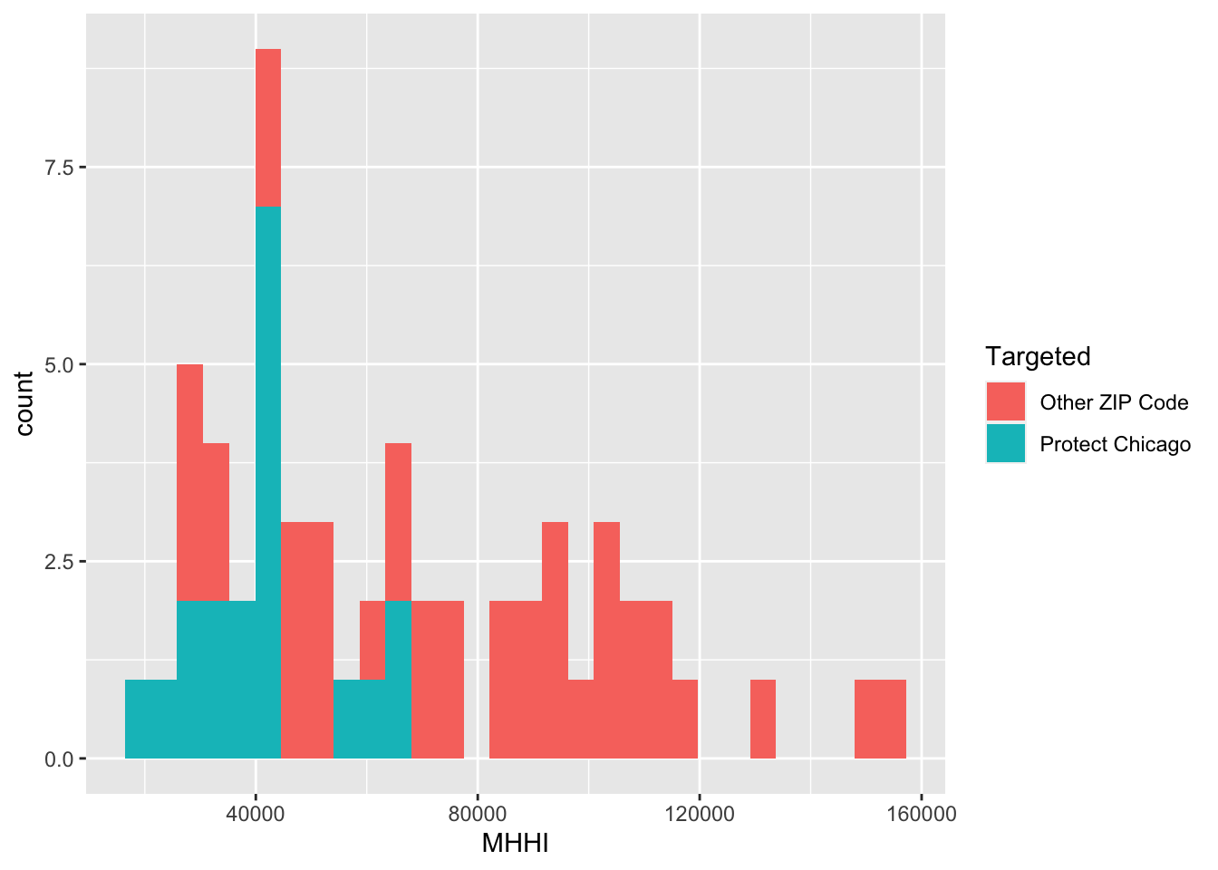
chi_zcta %>% ggplot(aes(x=MHHI, colour = Targeted))+geom_boxplot()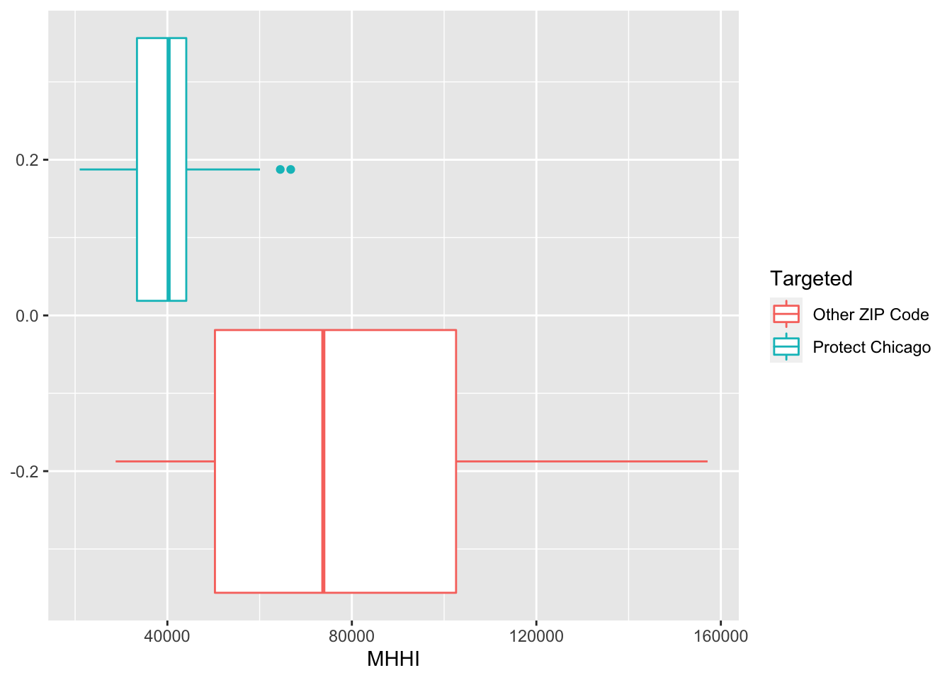
Exploratory Plots: Poverty
chi_zcta %>% ggplot(aes(x=Pov, fill = Targeted))+geom_histogram()## `stat_bin()` using `bins = 30`. Pick better value with `binwidth`.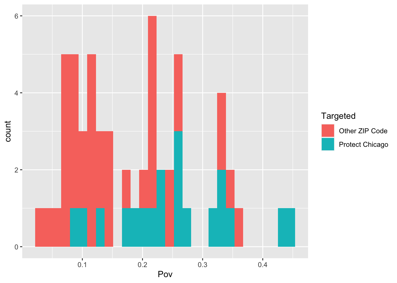
chi_zcta %>% ggplot(aes(x=Pov, colour = Targeted))+geom_boxplot()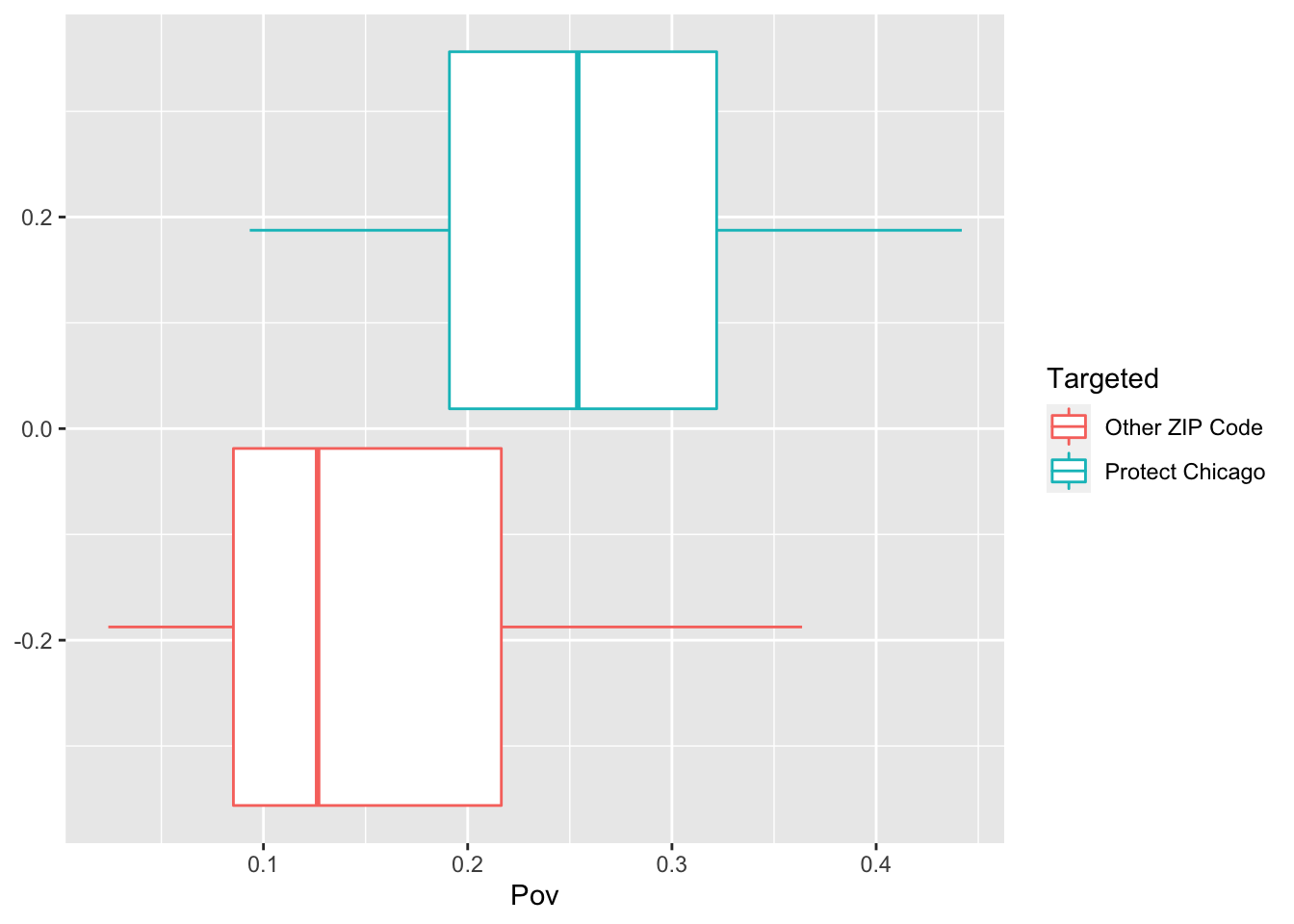
Exploratory Plots: Nonwhite Population
chi_zcta %>% ggplot(aes(x=PNonwhite, fill = Targeted))+geom_histogram()## `stat_bin()` using `bins = 30`. Pick better value with `binwidth`.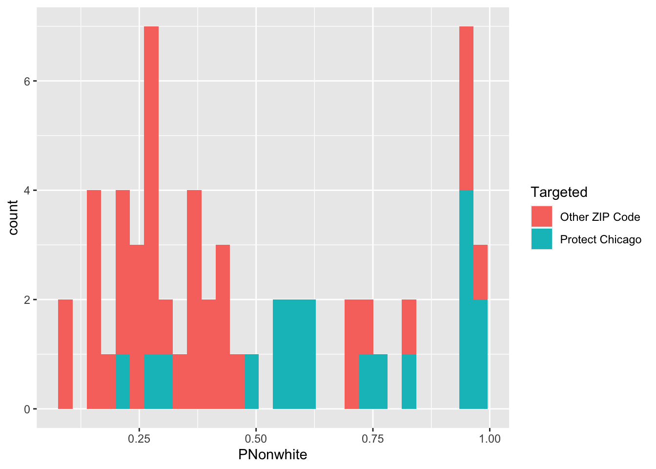
chi_zcta %>% ggplot(aes(x=PNonwhite, colour = Targeted))+geom_density()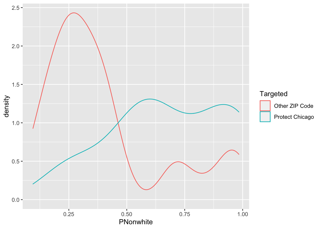
chi_zcta %>% ggplot(aes(x=PNonwhite, colour = Targeted))+geom_boxplot()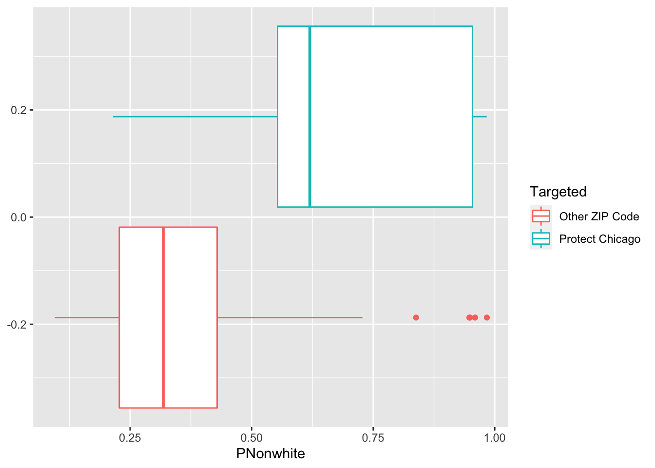
Exploratory Plots Workers in Service Occupation
chi_zcta %>% ggplot(aes(x=ServOccup, fill = Targeted))+geom_histogram()## `stat_bin()` using `bins = 30`. Pick better value with `binwidth`.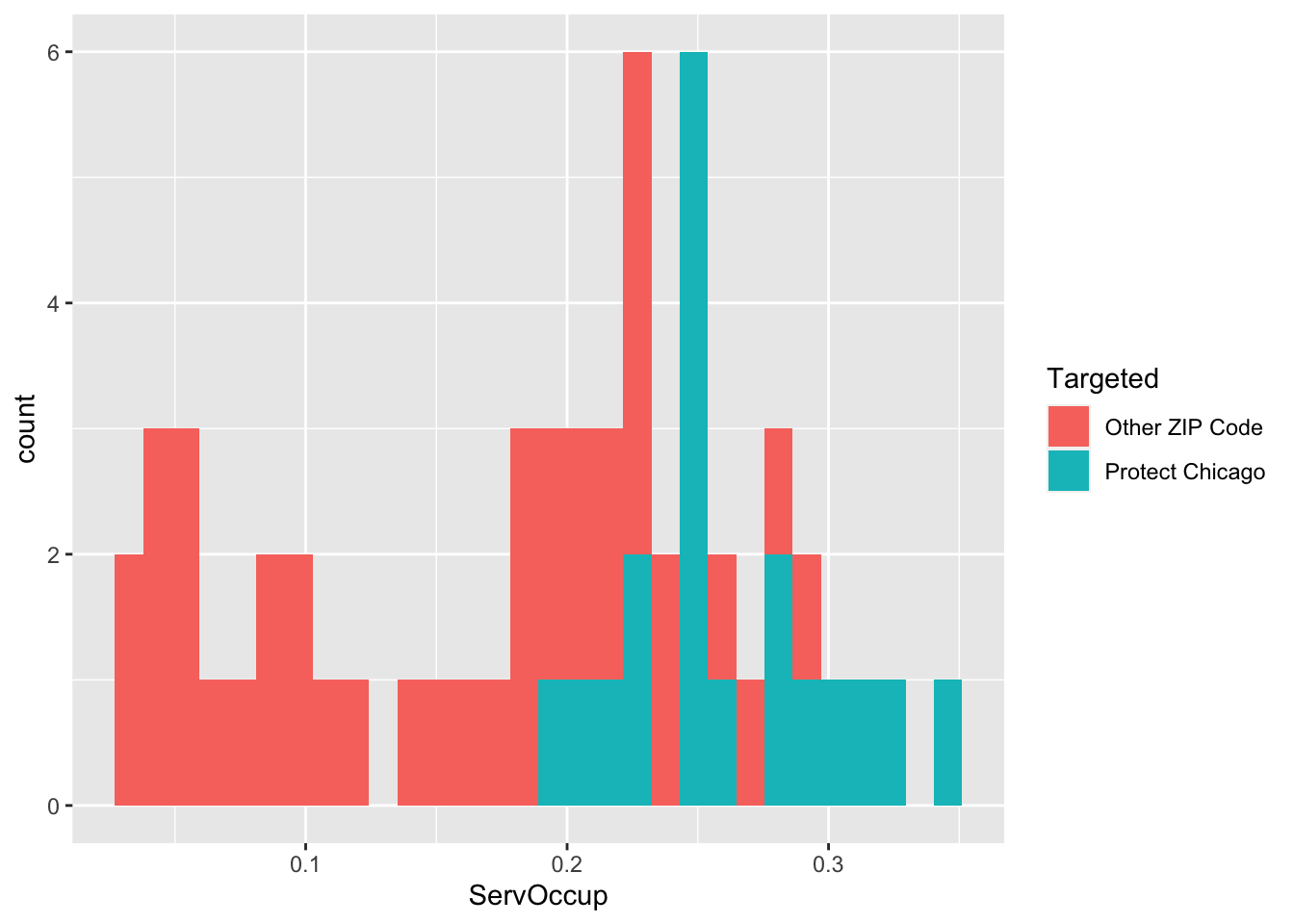
chi_zcta %>% ggplot(aes(x=ServOccup, colour = Targeted))+geom_density()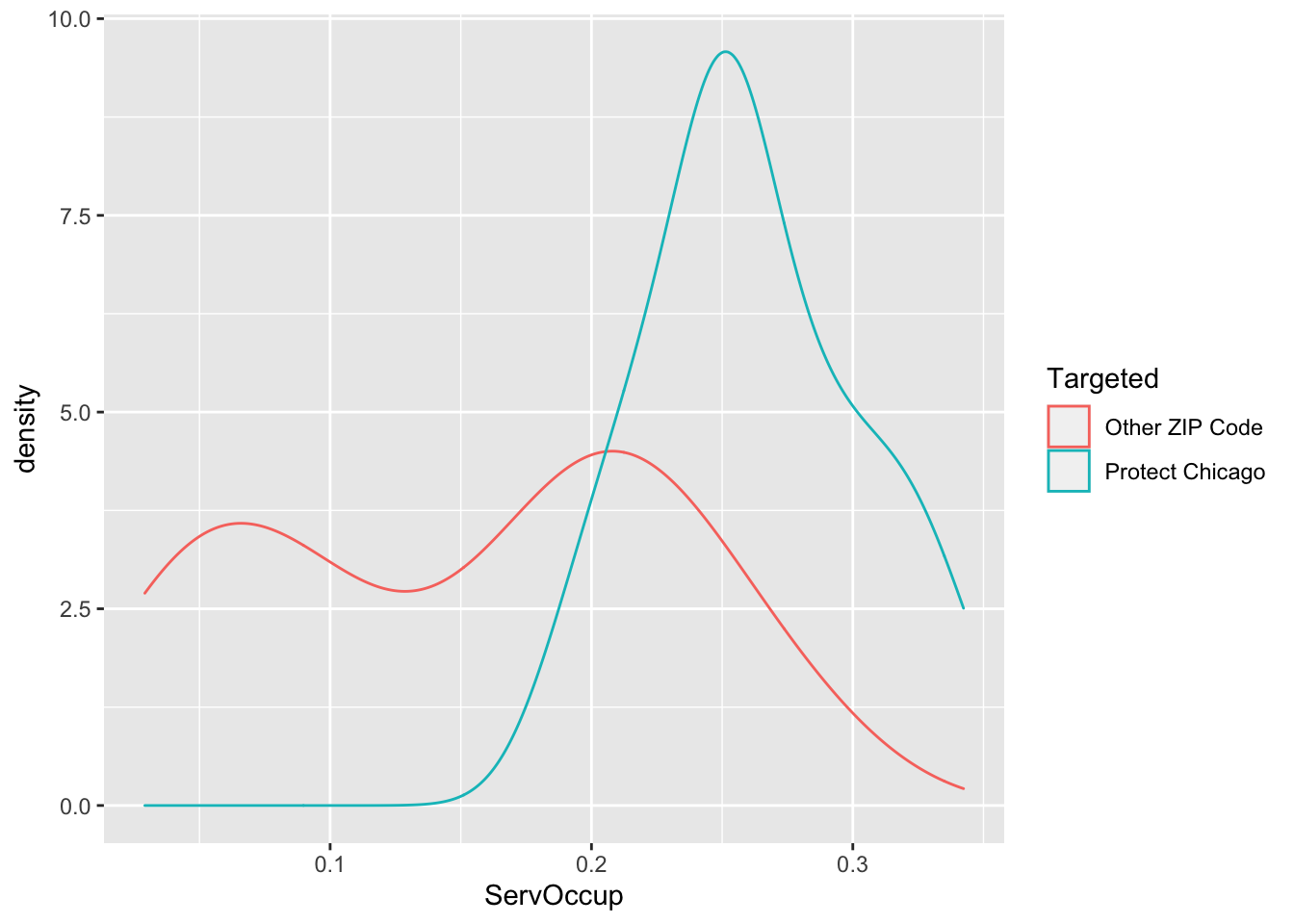
chi_zcta %>% ggplot(aes(x=ServOccup, colour = Targeted))+geom_boxplot()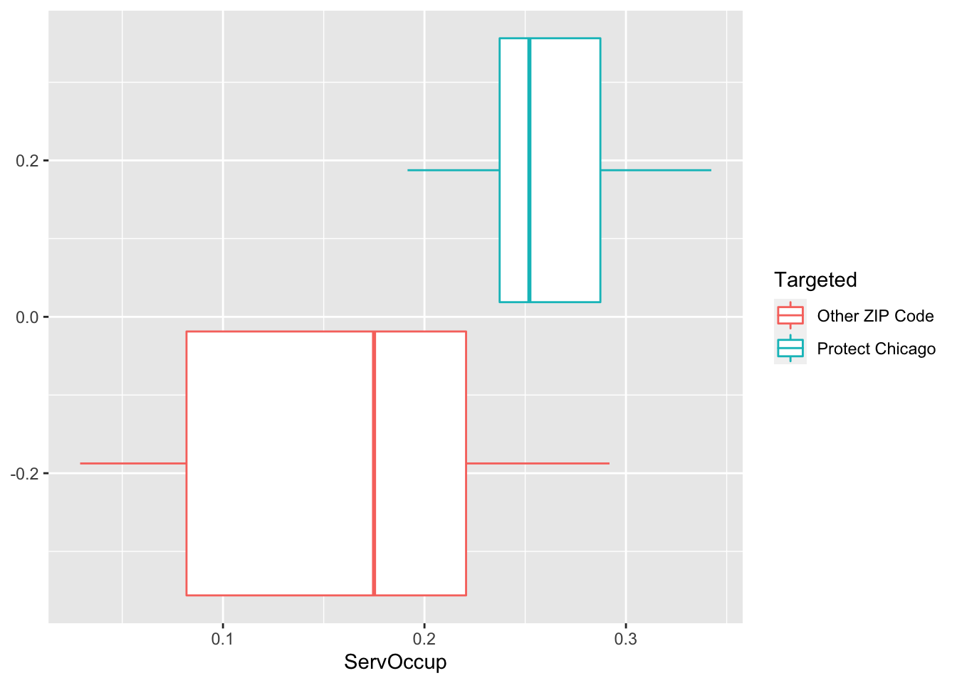
Questions
What questions do these exploratory plots and tables bring to mind? What other types of information would you want to overlay next in order to explore further?